
Choosing the right color palette for your interiors is more than just picking hues—it’s about creating harmony, setting the mood, and reflecting your personal style. Here’s a comprehensive guide to mastering color in your home design.
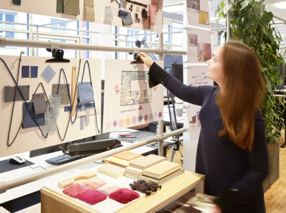
A word from the experts
Interior design experts suggest testing colors under different lighting conditions. Natural and artificial light can drastically change how a color looks, so always view samples in the actual space at various times of the day.
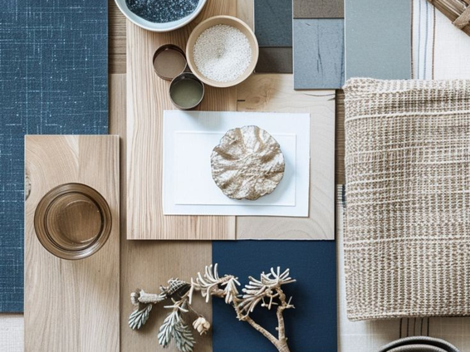
Start with a Color Family
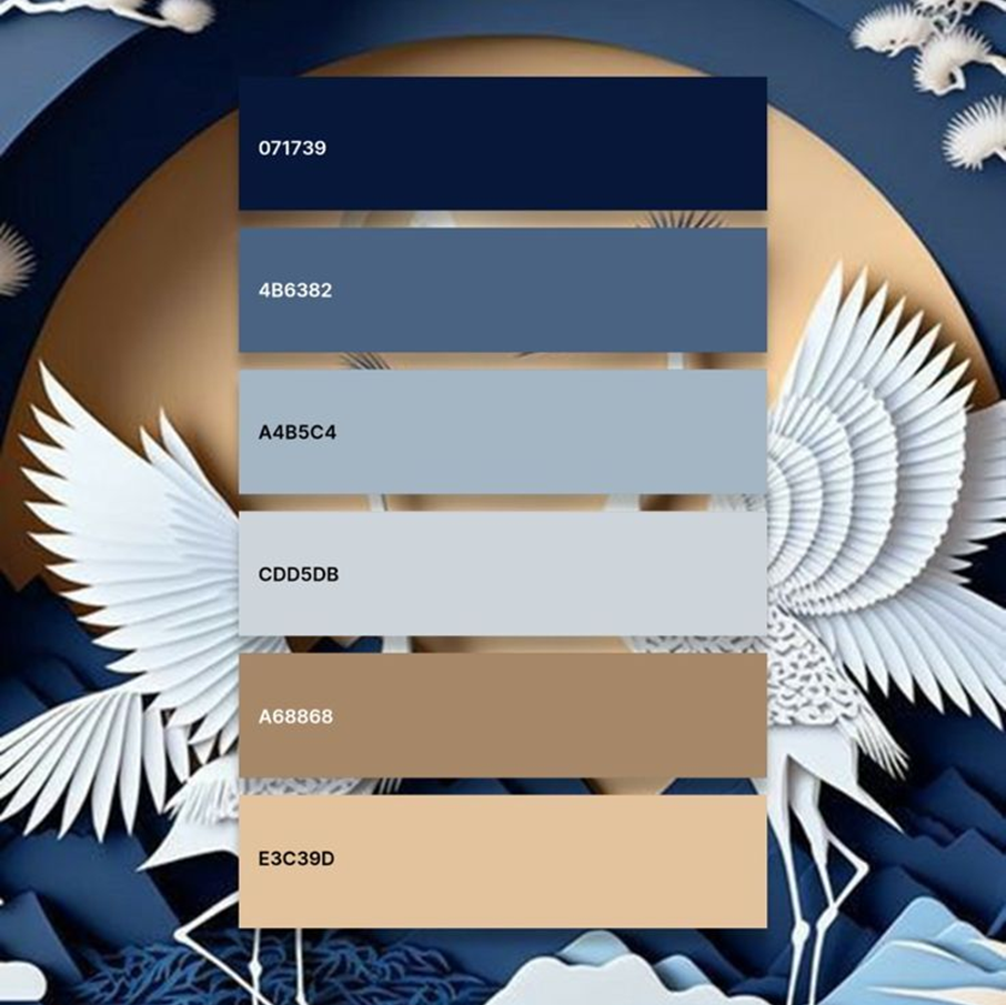
Guide to color your space effectively
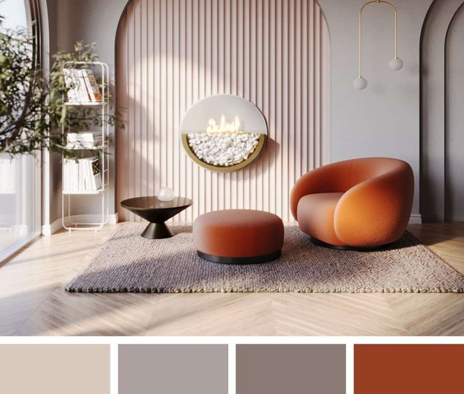
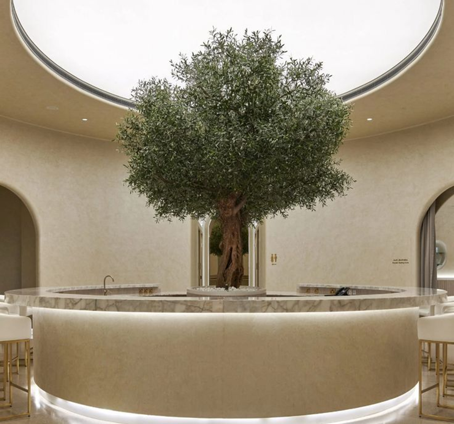
The placement of dominant paint colors on your walls
Decide the overall vibe you want to achieve. Do you envision a cozy, warm space or a serene, cool retreat? Colors from the same temperature family create unity:
- Warm tones like reds, oranges, and yellows exude energy and vibrancy.
- Cool tones such as blues, greens, and purples bring calmness and serenity.
For balance, mix in neutral tones like beige or gray, which can bridge between warmer and cooler accents.

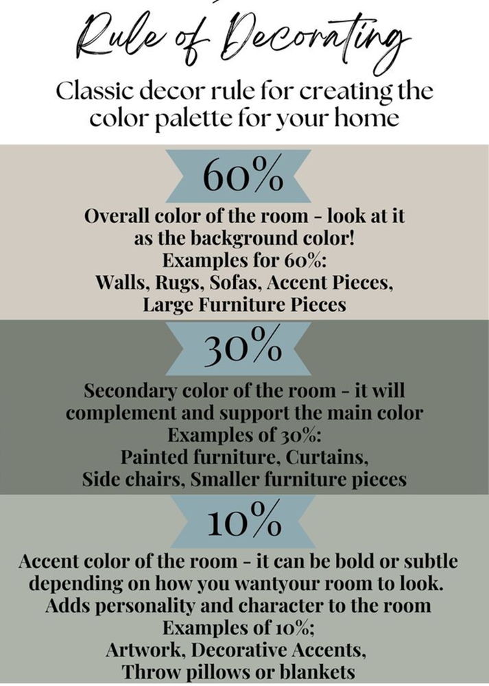
Apply the 60-30-10 Rule
This timeless rule ensures balance:
60% Primary Color: Dominates the space, often on walls or large furniture.
30% Secondary Color: Supports, showing up on curtains or accent walls.
10% Accent Color: Adds flair through decorative items like cushions or art.
Consider Lighting’s Role
Lighting changes how colors appear:
Natural light varies throughout the day—soft in the morning, intense by noon, and warm by evening.
Artificial lighting influences hues too; incandescent light enhances warm tones, while LED or fluorescent light may cool them down.
Match Colors with Room Functionality
Each room has a purpose, and its palette should support that:
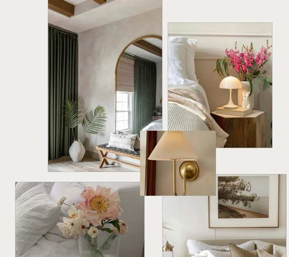
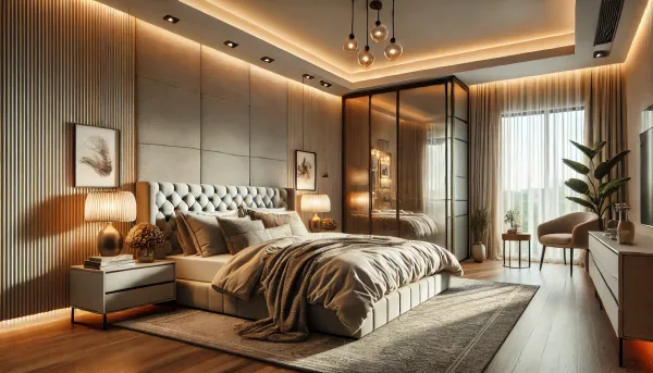
- Bedrooms: Soft pastels or cool tones foster relaxation.
- Living Rooms: Warm, inviting shades encourage socialising.
- Workspaces: Neutral tones with hints of energising colors like green or yellow can boost productivity.
Leverage Monochromatic or Complementary Schemes
To delve deeper into monochromatic, complementary, and analogous color schemes, here’s a detailed breakdown:
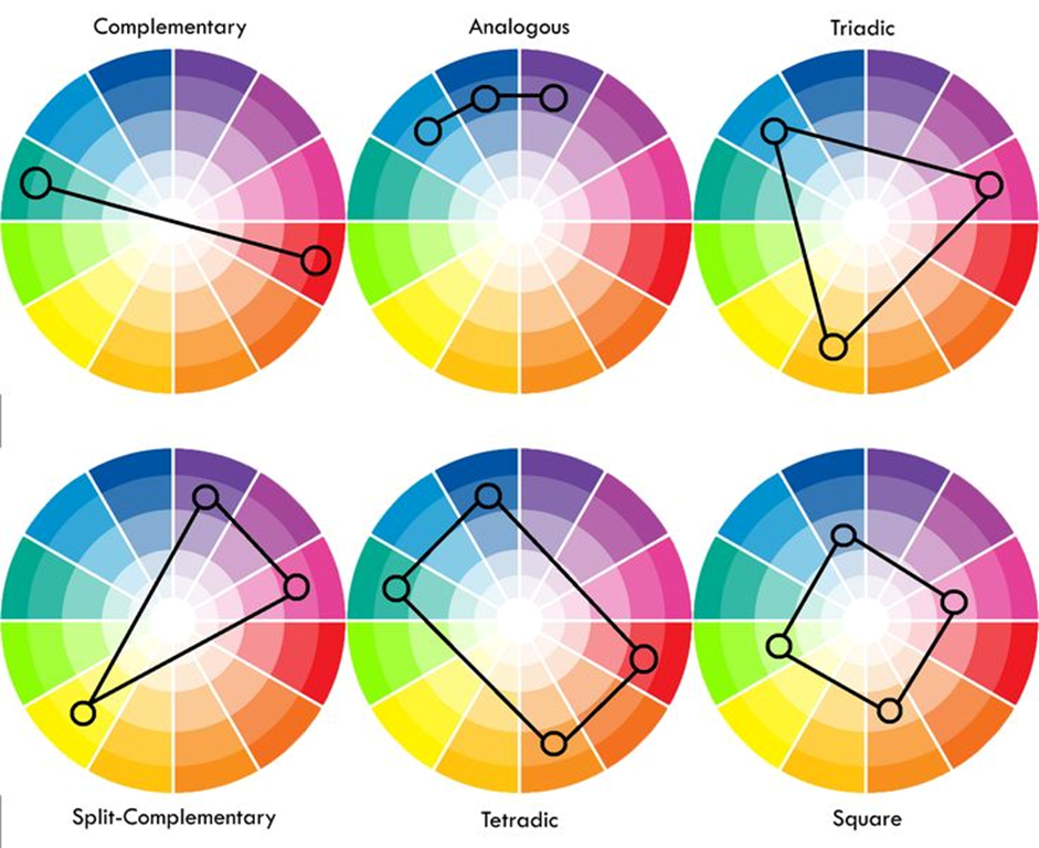
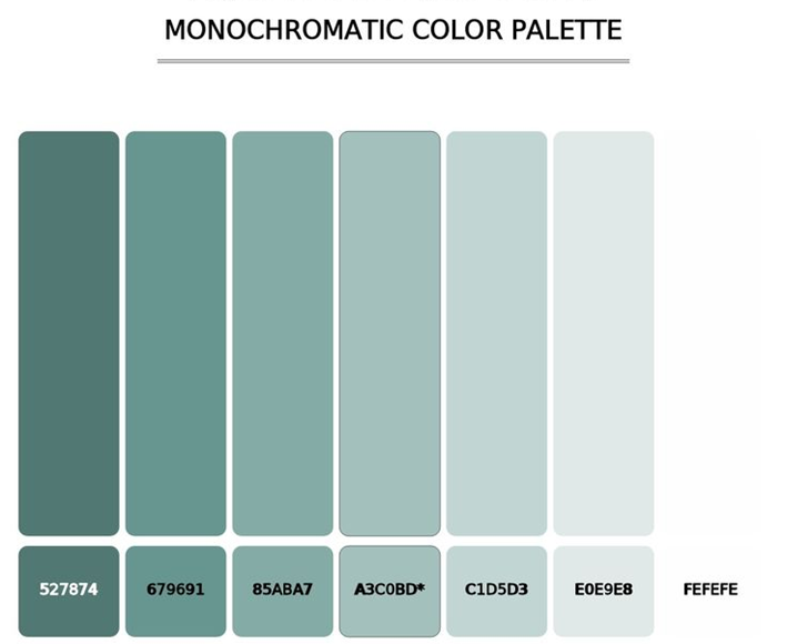
Monochromatic Palettes
A monochromatic palette uses varying tones, tints, and shades of a single hue. This approach creates:
Sophistication and Simplicity: It offers a sleek, unified look that’s easy to coordinate.
Depth through Variation: By incorporating lighter and darker versions of the same color, you avoid a flat, monotonous effect. For example:
Pair navy blue walls with pale blue furnishings and cobalt accents.
Add texture and contrast through patterns or materials (e.g., matte vs. gloss finishes).
Versatility: Ideal for minimalist and modern interiors where a calm, cohesive atmosphere is desired
Complementary Palettes
Complementary colors are opposite each other on the color wheel, such as:
- Blue and Orange
- Yellow and Purple
- Red and Green
Using complementary schemes:
Adds Drama and Energy: The stark contrast creates a dynamic and vibrant space.
Achieves Balance: Overuse of complementary hues can overwhelm. Balance them by letting one dominate (e.g., orange walls with blue accents).
Best for Highlights: Reserve complementary colors for decor, upholstery, or accent pieces to avoid visual strain.

Analogous Palettes
Analogous schemes use colors adjacent on the color wheel, such as:
Blue, Green, and Teal or Yellow, Orange, and Red
Soft and Natural: These palettes mimic tones found in nature, creating a serene and visually cohesive environment.
Gradient Effect: Blending neighboring hues provides a gradual transition between colors, perfect for creating flow across rooms or within open-concept spaces.
Tips for Analogous Schemes:
Vary Saturation: Use bold shades for focal points and softer ones for background elements.
Incorporate Neutrals: Balance bold analogous colors with neutral tones like white, beige, or gray.
When to Use Each Scheme
Monochromatic: Use when you want a clean, understated aesthetic with a modern vibe.
Complementary: Ideal for playful, bold interiors where contrast is desired.
Analogous: Perfect for transitional spaces, bedrooms, or areas needing a soft, harmonious look.
Conclusion
Learnings to Take with Us
Your color palette is the foundation of your design. It sets the tone and connects every element of your home. Whether you embrace bold contrasts, calming neutrals, or vibrant accents, let your choices reflect your personality and enhance your space.

Reach Out
For questions, comments, or suggestions, email the team at sales@feebo.in


Member comments