
Prepared by: The Marketing Department at Feebo
Introduction
Color is an essential element in architectural and interior design, playing a crucial role in shaping human perception, mood, and behavior. From ancient civilizations to modern-day urban planning, color has been used strategically to create aesthetic harmony, evoke emotions, and influence decision-making. Whether it is a hospital designed to soothe patients, an office optimized for productivity, or a school meant to stimulate learning, color choices contribute significantly to the overall experience of a space.
This blog explores the psychology of colors, their impact on emotions and behavior, and how they can be used to transform architectural spaces. Understanding these principles can help designers, architects, and homeowners make informed decisions when selecting color palettes.
Understanding the Science Behind Color Psychology
1. The Interaction of Color and Human Perception
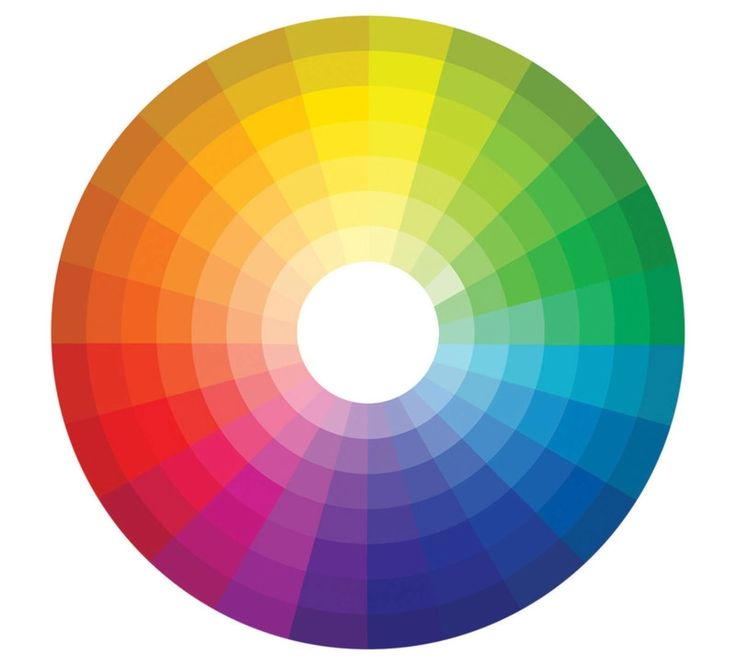
Color is a perception created by the way light interacts with our eyes and brain. The human eye detects color through specialized cells called cones, which respond to different wavelengths of light. These signals are then processed in the brain, triggering emotional and physiological responses.
Color perception is influenced by multiple factors, including:
Psychological Conditioning: Personal experiences shape how we react to colors. For instance, someone who associates blue with the ocean may find it calming, while another person may perceive it as cold and distant.
Cultural Influences: Colors carry different meanings across cultures. In Western societies, white is associated with purity and weddings, whereas in many Asian cultures, it represents mourning and funerals.
Biology: Humans are naturally drawn to certain colors due to evolutionary adaptations. For example, red is often associated with alertness and danger, possibly because of its connection to blood and fire.
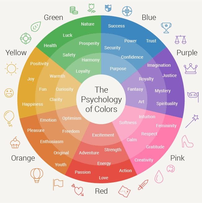
2. The Emotional and Psychological Impact of Colors
Each color elicits a unique psychological response. Below is a detailed breakdown of various color families and their emotional associations.
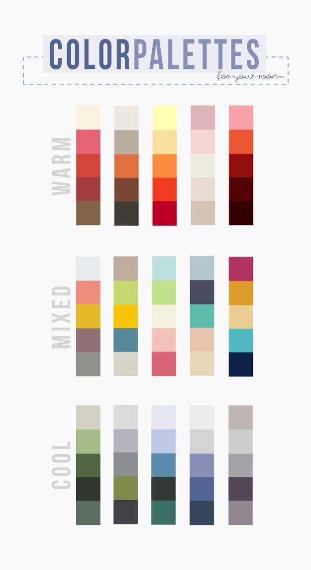
Warm Colors: Energy, Passion, and Stimulation
Warm colors are those that contain shades of red, orange, and yellow. They tend to create a sense of warmth, excitement, and dynamism but can also evoke aggression or overstimulation if overused.
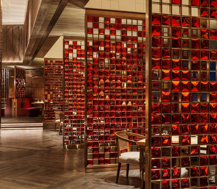
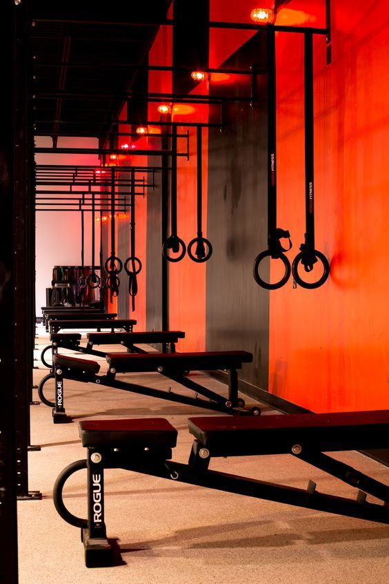
- Red:
- Increases heart rate, blood pressure, and appetite.
- Represents love, passion, power, and urgency.
- Used in restaurants to stimulate hunger and social energy.
- Excessive use can cause anxiety or aggression.
- Orange:
- Encourages enthusiasm, creativity, and friendliness.
- Often found in fitness centers, casual eateries, and collaborative workspaces.
- Can be overwhelming if used excessively.
- Yellow:
- Symbolizes happiness, optimism, and warmth.
- Stimulates mental activity and alertness, making it ideal for schools and offices.
- Overuse or overly bright tones can cause irritation or anxiety.

Cool Colors: Tranquility, Focus, and Relaxation
Cool colors include blue, green, and purple, which evoke a sense of calm, focus, and relaxation.
- Blue:
- Reduces stress and promotes concentration.
- Associated with trust, dependability, and professionalism.
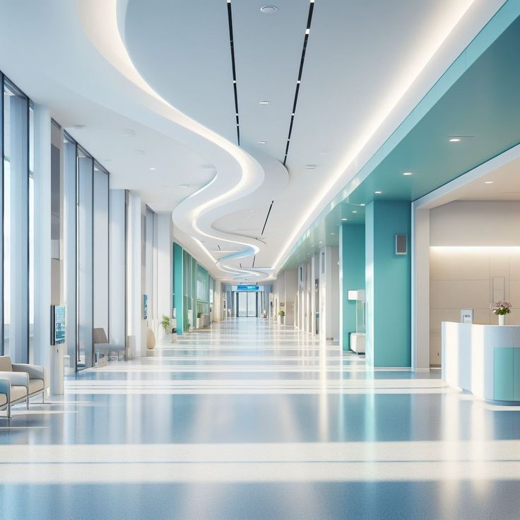
- Frequently used in offices, hospitals, and corporate settings.
- Too much blue can create a cold or distant atmosphere.
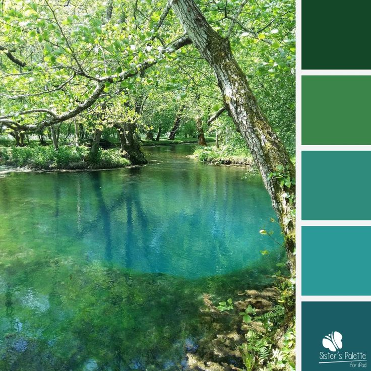
- Green:
- Represents nature, balance, and tranquility.
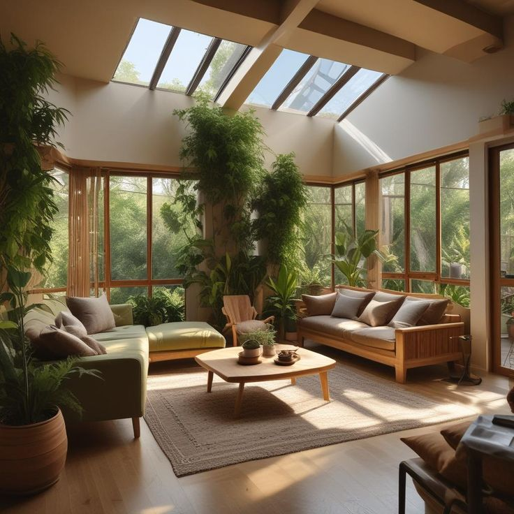
- Enhances relaxation and reduces eye strain, making it perfect for biophilic designs.
- Often found in wellness spaces, classrooms, and eco-friendly environments.
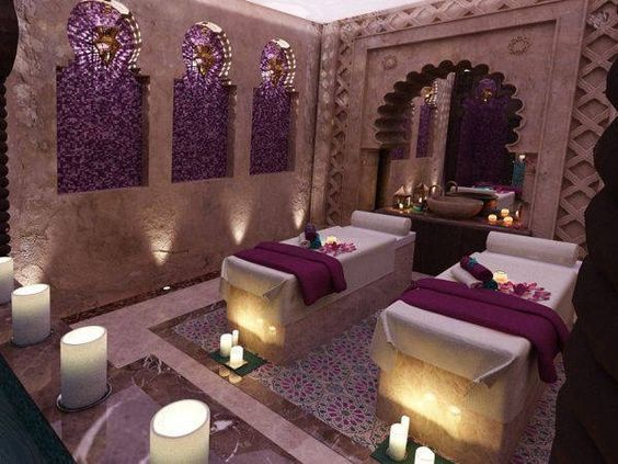
- Purple:
- Associated with luxury, wisdom, and spirituality.
- Light purple (lavender) is calming, whereas deep purple (royal) is bold and dramatic.
- Used in spas, boutiques, and creative studios.
Neutral Colors: Versatility, Elegance, and Simplicity
Neutral colors act as a foundation for other colors or create timeless and sophisticated spaces.
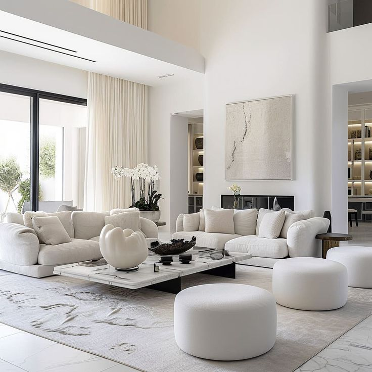
- White:
- Represents purity, simplicity, and spaciousness.
- Enhances natural light but can feel sterile if overused.
- Common in modern and minimalist designs.
- Gray:
- Offers balance and sophistication.
- Often used in offices and urban spaces for a neutral backdrop.
- Overuse can lead to a dull or uninspiring atmosphere.
- Black:
- Conveys luxury, mystery, and depth.
- Often used in high-end retail and formal settings.
- Too much black can create a heavy or oppressive feel.
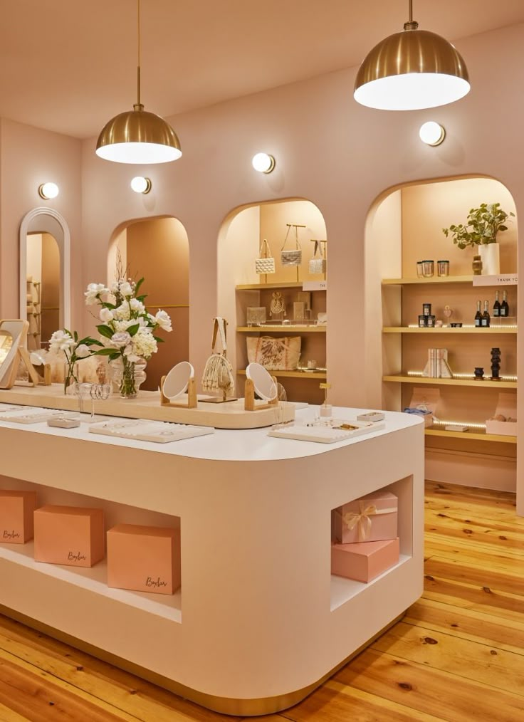
Transforming Spaces Through Strategic Use of Color
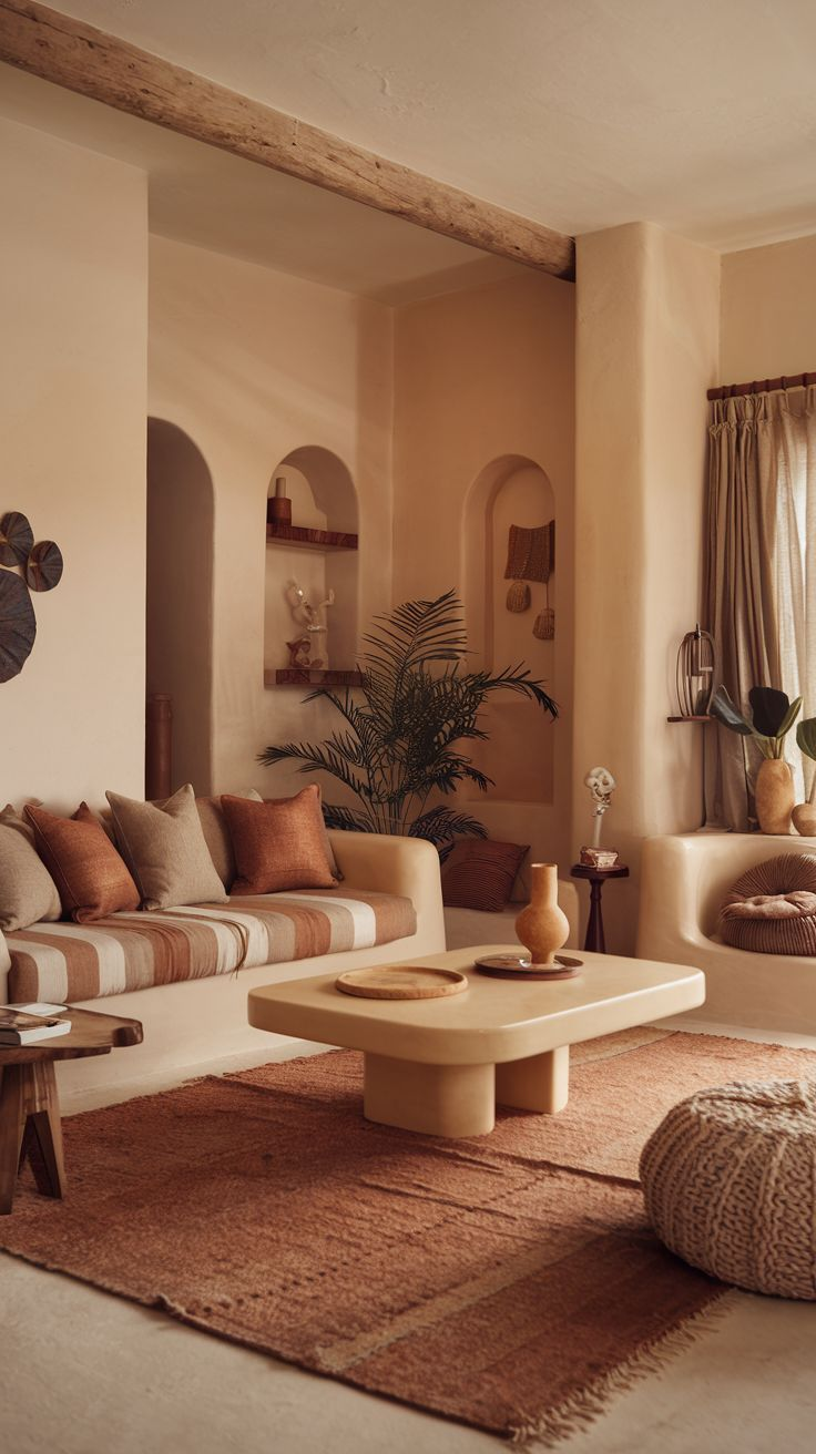
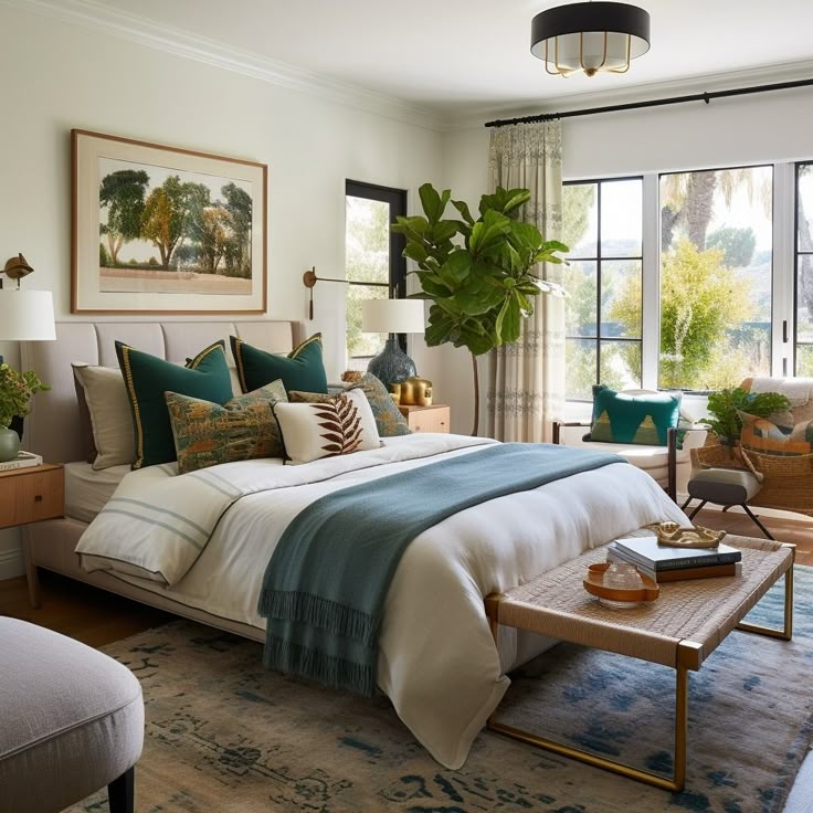
1. Residential Interiors
- Living Rooms: Earthy tones like beige and terracotta promote warmth and sociability.
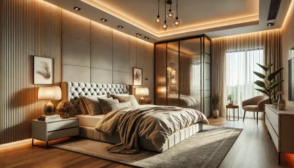
- Bedrooms: Cool blues and greens enhance relaxation and improve sleep quality.
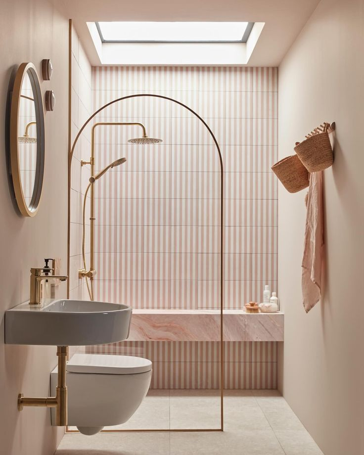
- Bathrooms: Soft whites and pastels create a clean, spa-like atmosphere.
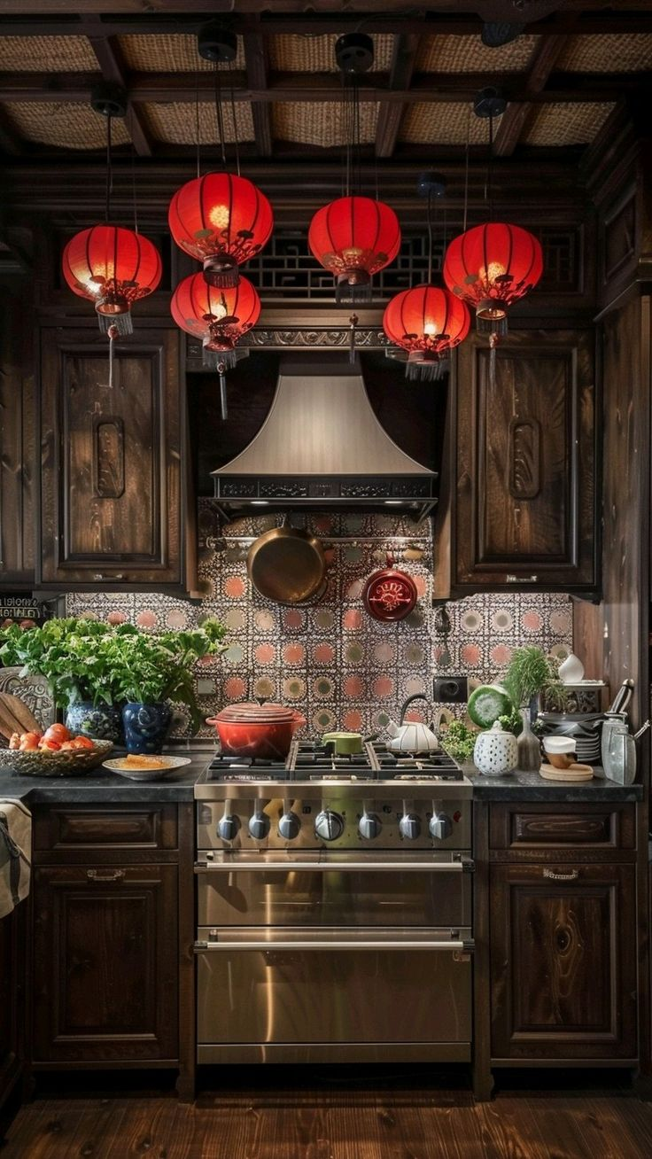
- Kitchens: Warm yellows and reds encourage appetite and energy.
2. Educational Spaces
- Classrooms: Light blues and greens boost focus and reduce anxiety.
- Libraries: Muted earth tones encourage concentration.
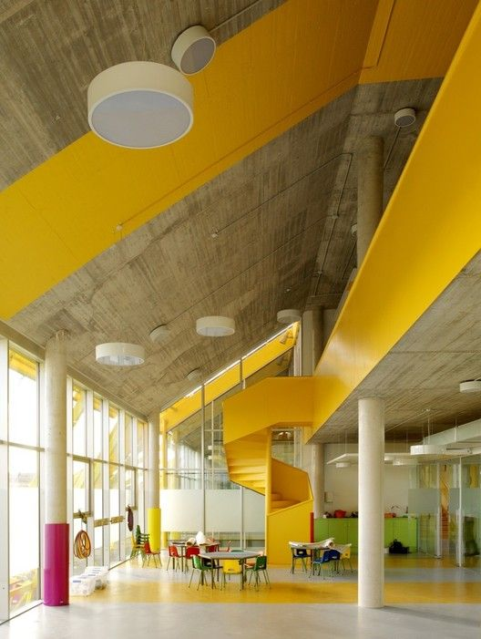
- Play Areas: Bright yellows and oranges stimulate creativity and activity.
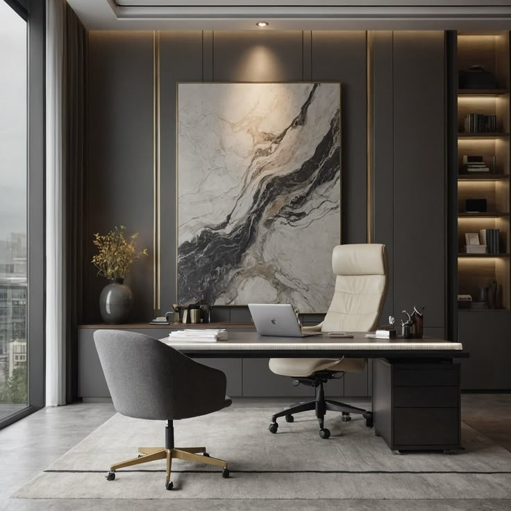
3. Workspaces and Offices
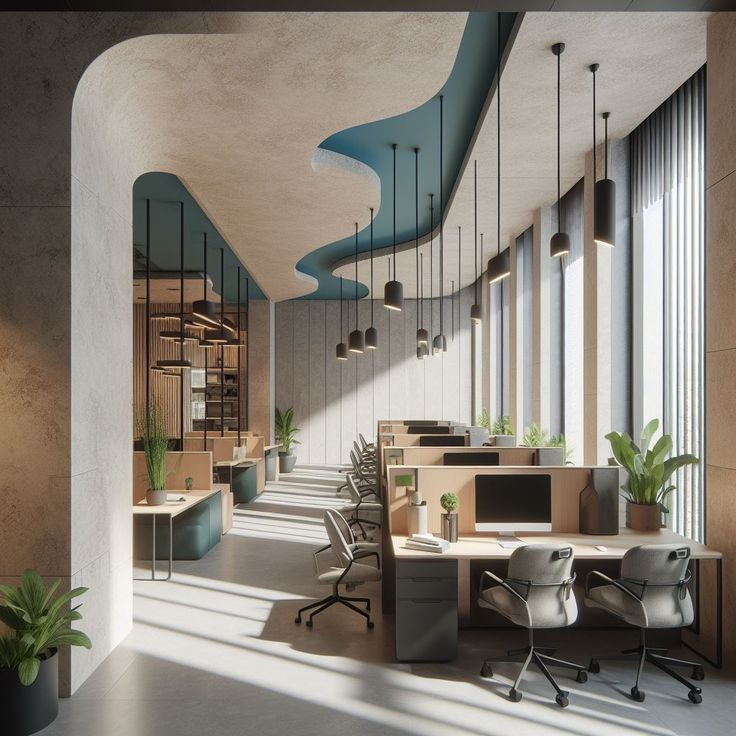
- Blue and green tones increase productivity and reduce stress.
- Yellow accents promote creativity in brainstorming rooms.
- Neutral backgrounds provide a professional and adaptable workspace.
4. Healthcare and Wellness Spaces
- Soft blues and greens soothe patients in hospitals and clinics.
- Lavender and pastel tones create a calming therapy environment.
- White and beige convey cleanliness but should be combined with warm tones for comfort.

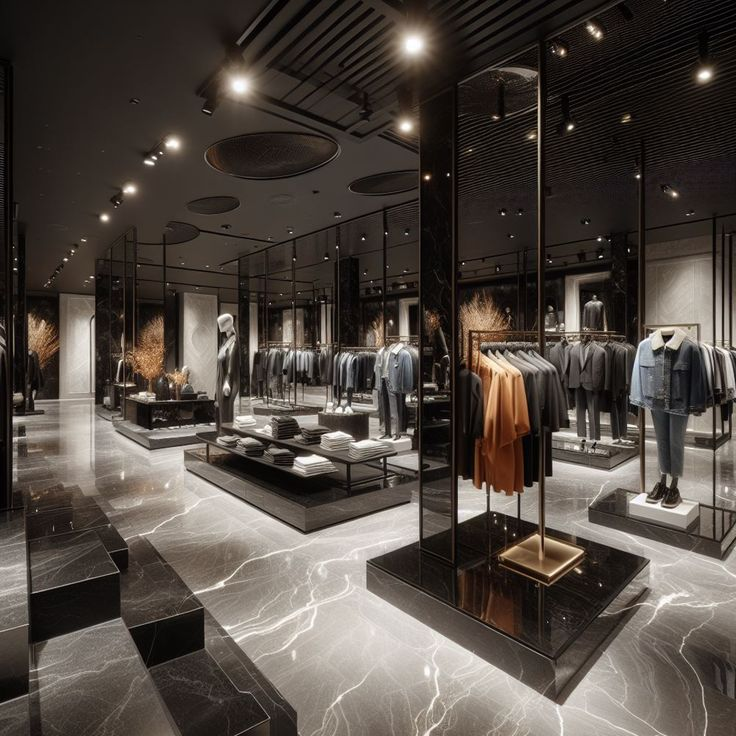
5. Commercial and Retail Spaces
- Red and orange create excitement and urgency in sales-driven businesses.
- Green and blue convey trust in eco-conscious brands and financial institutions.
- Black and gold enhance luxury branding.
Cultural Interpretations of Color
Cultural Interpretation of Colors in India
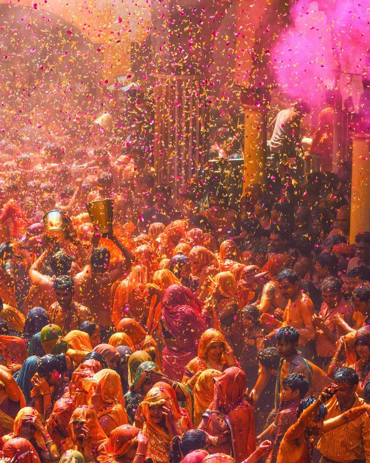
In India, colors hold deep cultural, spiritual, and social significance, influencing festivals, rituals, and even daily life. Here’s how various colors are interpreted in the Indian context:
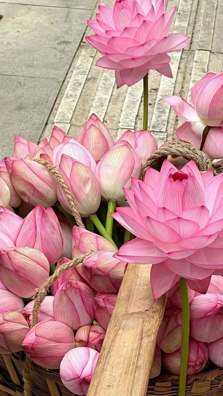
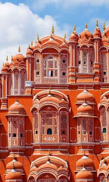
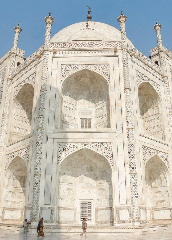
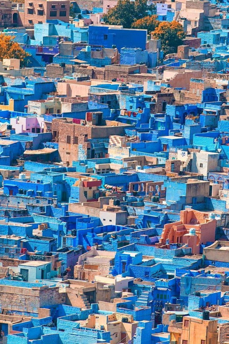
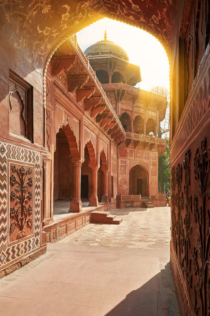
Pink – Represents love, kindness, and warmth. Jaipur, known as the "Pink City," was painted pink to symbolize hospitality. Pink is widely used in Indian fashion, particularly in traditional attire for celebrations.
Black – While often considered inauspicious in traditional beliefs, black is also used for protection against evil. People wear black threads or kohl to ward off negative energy. However, in modern India, black is increasingly associated with sophistication and power in fashion and design.
Orange (Saffron) – The most sacred and religious color in India, saffron represents sacrifice, purity, and renunciation. It is the color of the robes worn by saints and monks and is also found in the Indian national flag, symbolizing courage and spiritual strength.
White – Traditionally associated with mourning and renunciation, white is worn by widows in some Indian communities and is used in funeral ceremonies. However, in contemporary design, it symbolizes peace and simplicity.
Green – Signifying life, nature, and harmony, green is associated with prosperity and is considered a sacred color in Islam, which has a significant cultural presence in India. It also symbolizes new beginnings, especially in harvest festivals.
Blue – A representation of divinity and strength, blue is linked to Hindu deities like Lord Krishna and Lord Shiva, who embody protection and cosmic energy. It is also seen as a calming and trustworthy color in Indian culture.
Yellow – Associated with knowledge, wisdom, and spirituality, yellow is worn by scholars and used in religious rituals. It is the color of turmeric, an auspicious spice in Hindu culture, and is prominent in festivals like Vasant Panchami.
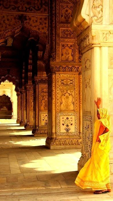
Red – A symbol of prosperity, power, and marriage, red is deeply rooted in Indian traditions. Brides wear red sarees or lehengas during weddings, and the color is used in religious ceremonies and festivals like Durga Puja. It also represents Shakti (divine feminine energy).
These cultural interpretations influence architecture, fashion, festivals, and interior design in India, making color an integral part of everyday life. Would you like to explore how these cultural color meanings can be applied to school design?
The Future of Color in Architecture
With advancements in technology, dynamic lighting and smart color-changing materials allow for adaptable spaces. Biophilic design trends are leading to more nature-inspired palettes, reinforcing well-being and sustainability.
Conclusion
The psychology of color is a critical element in spatial design, affecting emotions, productivity, and experiences. Understanding how different hues influence human psychology enables architects and designers to craft spaces that enhance comfort, functionality, and engagement. Whether designing a home, school, office, or hospital, the right color palette can transform a space into a welcoming, inspiring, and purposeful environment.
By strategically incorporating colors, designers can go beyond aesthetics and create spaces that truly resonate with their users.
Reach Out
For questions, comments, or suggestions, email the team at sales@feebo.in


Member comments